Exhibit 1
USU STARS! Gear Up | Utah State University | Web Announcement

Background Information
In this exhibit, I wanted to seamlessly tie in the four main graphic design principles and experiment creatively with typography.
Editing
I used an image from iStock by Getty Images. I decided to use this picture because the focus was the baby, readers would relate to it because they were once a baby as well and the text connected well to the picture. I edited the picture to be black and white so that 1) the text would pop out more, especially if I used color and 2) I could edit it more so the baby would be the focal point of the graphic. Using Camera Raw, I sharpened details and increased luminance so the baby wouldn’t be as blurry. I then added a vignette effect around the edges to place even more emphasis on the baby.
Design
The text was placed in the bottom right corner near the baby’s feet so readers would make the connection between the message and the picture. I aligned the text to be flush with the right side and close together so readers would understand that it was one coherent message. I strictly used two variations of sans serif fonts in this exhibit because these fonts are easier to read on a screen and I could contrast them using different font colors, types and textures. The two fonts I used were:
Font 1: Gill Sans Ultra Bold
Font 2: Century Gothic, Regular
I went with a regal blue font color so it could still pop from the black and white background and draw just enough attention away from the picture’s focal point. Both “first step” and “higher education” are in color because they are the most important things to take from the message. The text around the baby’s head represents the Gear Up program’s academic goals and the many options people have when pursuing higher education. I wanted the text around the baby's head to connect to the text in the bottom right corner, so I added a small chalk brush stroke underneath the last line.
I experimented with brush strokes and paths and was able to create a chalky texture for the font above the baby’s head. The chalk effect conveys an underlying message that even when you are young, the things you learn will be stepping stones toward higher education.
Credit
Images taken from https://www.istockphoto.com/
Exhibit 2
188th Semi-Annual General Conference | The Church of Jesus Christ of Latter-Day Saints

Background Information
I was asked to create a design that was relevant and meaningful to me. On October 6-7, 2018 the Church of Jesus Christ of Latter-Day Saints will be holding the 188th Semiannual General Conference. Thousands of members across the world will gather together to hear messages from church leaders and the prophet. The purpose of this design was to encourage others to listen to messages from LDS leaders and “gain an eternal perspective”.
Design Thoughts
-
Contrast: A bright and warm font color against a cool, gray-tone background. Bold, bevel-embossed text for the main message and simple, thin text for filler words to complete the message. Drop shadow effects added to make text pop against the background.
-
Repetition: Repeating the text effects on important text so the main message is emphasized. Repeating the warm elements of the photo so it creates a harmonious color scheme.
-
Alignment: All main text is centered, making it easy to read and follow what your eye is naturally drawn to in the photo. The filler word and website reference are both right aligned creating an overall flow.
-
Proximity: The bright light in the center surrounded by “eternal perspective” is inviting and can be interpreted as the main message without seeing the rest of the design. The website reference is placed in the bottom right corner away from the main message, but draws attention after the main message is received.
-
Font choice: I chose the sans serif font, Franklin Gothic, with a heavy weight. I stayed within the same family and used Bradley Hand ITC in a lighter, italicized weight for filler words to create a connected and harmonious design.
Photoshop Skills
-
Simple use of layers and varying opacity levels to create faded temple background and a slightly transparent photo as the foreground.
-
Created white base layer so temple background could be more recognizable with low opacity levels.
-
Warped text to specified size and bend around the hand using the transform → warp tool.
Credits
-
The foreground image was a public domain image from lifeofpix.com by user- Obelixy Obelixy: https://www.lifeofpix.com/search/sun/2/?category=&orientation=&color=
-
The background image was a downloaded image from Pinterest user- Modest Style Blog: http://modest-style.com/lds-temple-dress-ft-house-of-order/
-
Font: Franklin Gothic Heavy | Bradley Hand ITC
Exhibit 3
Hike The Flatirons | Boulder, CO | Postcard
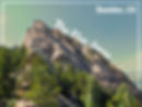
Background Information
For this piece, I was asked to experiment with color. The first thing I thought I could highlight was my home state, Colorado and one of its famous monuments and parks. The Flatirons is a popular tourist destination in Boulder, CO.
Design Thoughts
-
Contrast: The white text contrasts well against the background. The flatirons is also a layer mask, so it stands out more against the blurred and blended background.
-
Repetition: The same font is used throughout the design and colors from the center picture is used in a blended layer.
-
Alignment: The picture is centered and the flatirons text is placed in between the picture to create a more interactive design. The location is flush to the right side.
-
Proximity: All of the text is within close proximity of each other so the message does not get lost in the picture.
-
Font choice: I chose a font that most closely matched the style on the Colorado state sign. I stayed within the sans serif family and stuck with one font type so it could be interpreted as one cohesive message.
-
Color: I wanted to highlight the naturals greens, blues and browns of the flatirons, so I used blending modes to make a harmonious design.
Photoshop Skills
-
Created a layer mask of the flatirons, so that I could create a slightly different background.
-
Created a solid green layer underneath the picture and used the multiply blending mode to create a more realistic and interesting background.
-
I feathered the edges of the flatirons mask, so it wouldn't be too sharp of a contrast.
-
I used the rectangular shape tool to create the white border.
Credits
-
Pictures taken by me
-
Font: Franklin Gothic Demi Cond, regular
Exhibit 4
Personal | Business Card


Background Information
I was asked to create a business card that appropriately applied contrast, repetition, alignment and proximity as well as expressed my personality. I decided to focus on my career and degree in public relations as the subject of the business card. Public relations houses many different job titles and specialties, so ‘strategic communicator’ is a unique and more professional way of phrasing PR professional. Many PR jobs are within PR agencies, so I created the impression that I represent an agency and am reaching out to potential clients with my business card.
Design Thoughts
-
Contrast: The picture is colorful and stands out the most against the card’s white background. The colors of the text were pulled from the picture and then darkened a little to retain more contrast.
-
Repetition: I use the same two colors in all of the text on the business card. The font choice is also consistent on the front and back side of the business card. Important details are bigger and darker than secondary information. Secondary information (like the contact information) is the same size throughout.
-
Alignment: I used a guide layout for the front and back side of the business card. I placed a 2x2 in. square on the left and two horizontal rows on the right so I could align my job title in the center. I used 0.5 margins on each side so any overflowing text would stop at the 0.5 mark. I aligned secondary information text to the left and broke the left flush line with my job title to foster a little more creativity and uniqueness. For the front side of the card, I aligned the title in the center and then rotate ‘The’ to also add a little more uniqueness instead of only having centered text. Using this principle, I was able to turn a simple design into a more unique one.
-
Proximity: All secondary information (like contact information) is grouped closer together to create a more harmonious design.
-
Font choice: I chose to use a sans serif and serif font to create an appealing contrast. The font choices are very similar in style, but the serif and sans serif difference makes them appear different and harmonious.
-
Color: All of the color in the text is pulled from the picture itself to create a harmonious design. I used a bold blue and duller brown to create more contrast.
Photoshop Skills
-
I decided to use this particular picture of hands coming together because PR is very collaborative and team-led. In Camera Raw, I brought down the highlights and slightly increased the contrast and darkness.
-
I took the edited picture and made a selection of just the hands using a combination of the brush tool, the quick select tool, and the polygonal lasso tool. I saved that selection and put it on top of a white background for my business card.
-
Some light brush work to give the outermost arm a faded effect, so it wouldn’t run into any text.
-
Used artboards feature to create the front and back side of the card at the same time.
Credits
-
Image taken from freephotos.cc
-
Font: Poor Richard, regular | Eras Light ITC, regular
Exhibit 5
Yellowstone National Park | Postcard

Before

After
Background Information
For this exhibit I decided to experiment with tools that I will use most often in my career and for personal projects. I used a picture that my roommate took of our trip to Yellowstone during spring break, and I edited it as if it were being used on a postcard. My goal was to create a design that brought out the best elements of the picture and created a harmonious connection to Yellowstone National Park.
Design Thoughts
-
Contrast: In Camera Raw, I increased the darks and decreased the highlights to bring out the natural colors and shadows of the two girls. Using a Levels and Curves adjustment layer in Photoshop, I brought out the blues and greens in the background scenery to make it more vibrant, and I decreased the reds to keep the girls’ skin color natural-looking. The logo and text stayed at 100% opacity so they would pop against the blurry background.
-
Repetition: The pulled colors from the National Park Service logo to use in the text. The blues and greens in the background of the picture blend well with the blues and greens in the foreground of the picture.
-
Alignment: The girls are kept at an intersection on a rule-of-thirds grid while the text fills the space in the upper right corner. Yellowstone National Park is flush left with the logo.
-
Proximity: All important elements of the picture and the text are in the foreground of the picture. The text and logo are given some breathing room in the upper right corner before the eyes are drawn to the girls.
-
Font choice: I used Poor Richard as my font choice because it was similar enough to the actual Yellowstone National Park sign, and it went well with the text already within the National Park service logo.
-
Color: The colors in the picture were edited to be more vibrant and inviting. The logo went well with the overall color scheme and did not clash.
Photoshop Skills
-
I created a layer mask over each of the girls’ faces and used surface blur and a combination of the spot healing brush tool and the healing brush tool to cover up blemishes.
-
There were several distracting elements like a camera strap, polka dots on the right girl’s sweater, and a logo on the baseball cap. To get rid of these, I used a combination of the patch tool, healing brush tool, quick mask tool, and lasso tool.
-
Used two adjustment layers to bring out the colors and darken the girls’ skin tones.
-
I resized the original picture to the standard dimensions of a postcard (6x4 in.)
Camera Raw Skills
-
In Camera Raw, I increased the vibrance and darks and I decreased highlights and shadows.
Credits
-
Image taken by https://kennamariephotography.myportfolio.com/
-
Font: Poor Richard, regular
Exhibit 6
Halakahiki Spa | Flyer, front & back


Before


Background Information
I was inspired to do a front and back a mock flyer for a spa business owned by my family. I used McWade’s “Design a Story-Style Brochure” as my main source of inspiration for layout. The name- Halakahiki Spa- is literally translated to “pineapple spa”, hence the use of the pineapple on the front flap.
Design Thoughts
-
Contrast: The pineapple and its colors really stand out against the washed out ocean background. The text on the front and back flap of the brochure stand contrast well against the white backgrounds.
-
Repetition: The font used for the name of the business is repeated in the contact information on covers of the flyer. The first letters of Halakahiki and Spa are in the same font for readers to draw a connection between the two. The layout of the front cover is repeated on the back, only flipped on a vertical axis.
-
Alignment: All text on the front is aligned with the right edge while all text on the back is aligned with the left edge. All of the text is also framed by bigger objects like the pineapple and the woman's face.
-
Proximity: Important contact information is grouped closer together to draw the attention to different areas.
-
Font choice: I used different weights of Berlin Sans FB for the majority of the text because it gives off a more tropical and light-hearted vibe. I decided to incorporate Edwardian Script ITC into the title to include a professional, elegant and relaxed vibe as well.
-
Color: I pulled colors from the pineapple for the main color scheme of my design. I incorporated these colors (shades of greens, yellows and browns) into the text as well as into the midtones and highlights of the picture on the back-flap.
Photoshop Skills
-
I used the Artboards photoshop feature to create a front and back flap of a mock brochure.
-
I used several adjustment layers on both pictures to create similar colors schemes.
-
The clone stamp tool and the healing brush tool were used to get rid of the man that was in the background of the picture on the back flap.
-
A combination of the spot healing brush tool, healing brush tool and patch tool were used to make some minor adjustments on the woman's face.
Camera Raw Skills
-
Increased the contrast and made darks and shadows stand out more in both pictures, so the objects in the foreground didn’t seem too washed out.
-
I also sharpened some details and dehazed the overall pictures.
Credits
-
Pineapple image taken from https://freephotos.cc/ | Image of woman taken by me
-
Fonts: Berlin Sans FB, regular & bold | Edwardian Script ITC
Exhibit 7
Aggie Chocolate Factory | Utah State University | Flyer

Background Information
For this exhibit I was asked to create a flyer about an event, business or organization. I focused on the Aggie Chocolate Factory at Utah State University that is set to host its grand opening this weekend.
Design Thoughts
-
Contrast: The font is white and stands out against the dark background. I additionally added some drop shadow and emboss effects to the text appear engraved into the wood.
-
Repetition: One text is used for the whole body of the flyer, so the Aggie Chocolate Factory logo can stand out. The jars are stacked on top of each other.
-
Alignment: Text is flush to the right side while the jars fill the space and are aligned with the text on the left side.
-
Proximity: There is a small space between the two bodies of text to show what information goes together.
-
Font choice: I used a simple font for all of the text, so it didn’t distract from the Aggie Chocolate Factory logo.
-
Color: Since I was advertising chocolate, I kept the color scheme simple and brown. I focused more on textures.
Photoshop Skills
-
I used the pen tool to select the Aggie Chocolate Factory text and all three of the cocoa jars. I then created layer masks and placed them on top of the wood paneling.
Camera Raw Skills
-
I took the wood paneling background and increased the contrast and clarity to emphasize the detail in the paneling. I also rotated the image, so it would align with the text.
Credits
-
Background image taken from https://freephotos.cc/
-
Aggie Chocolate Factory text taken from http://aggiechocolate.com/
-
Fonts: Goudy Old Style, bold and regular
Exhibit 8
Semester Deadlines | Utah State University | Web Announcement

Background Information
I was asked to create a digital display announcing a student deadline after Nov. 30 that would potentially be used across the Utah State University campus. I focused on the tuition and fee payment deadline because it is one of the most important deadlines for students to remember.
Design Thoughts
-
Contrast: The white text stands out against the dark, navy blue background. The blue gradient allows the Old Main outline to show through enough to be recognizable, but not too distracting from the main message.
-
Repetition: One font in varying weights is used throughout the entire design. Similar blues and whites and are used throughout the design’s color scheme.
-
Alignment: All text is centered to convey a professional and formal design. The text is aligned to the left of the display so it is naturally framed by the Old Main tower.
-
Proximity: Secondary information is grouped together below the initial announcement to convey to students that this information goes together. The deadline text is grouped slightly closer together to emphasize importance.
-
Font choice: I used one font, Verdana, because it’s simple and clean. This font also closely resembles other graphic work displayed at the university.
-
Color: I used a dark, navy blue as my main color because it matches with the university’s school colors. I didn’t want to stray too much from the university’s colors, so I stuck with blues, whites, blacks, and grays.
Photoshop Skills
-
I converted the Old main picture into a sketch so the details and outlines would stand out more behind a gradient, blue layer.
-
I created a gradient layer from blue → white over the Old Main sketch and then applied the Multiply blending mode.
-
I created a solid blue layer on top of the gradient layer and then applied the Multiply blending mode.
-
Added a Curves and Brightness adjustment layer to adjust the blues and make the tower stand out a little more.
Credits
-
Background image taken from USU Public Relations and Marketing office
-
Fonts: Verdana - bold, regular and italic
Exhibit 9
Gabrielle & Austin Wedding Announcement

Background Information
For this exhibit I was asked to create a Photoshop style and apply it to an image. I decided to create a mock announcement for my sister’s wedding. I created an elegant style for the text so it could pop as much as the beautiful pictures on the invitation.
Design Thoughts
-
Contrast: Using a combination of the bevel emboss, inner glow and drop shadow effects I was able to make the text stand rather than just making it all flat, red text. I added a Curves adjustment layer to the text and the pictures so the colors could really pop.
-
Repetition: I used the same color scheme throughout the design. I also used similar pictures with similar backgrounds and themes, so no colors would clash and look off.
-
Alignment: The text is centered for a more formal design. I decided to experiment with alignment for the pictures on the right, so it would still look neat, but not too dry.
-
Proximity: The text is grouped together to convey the important information. All of the pictures are also grouped together to convey the union between the couple.
-
Font choice: I used Vivaldi for the design because it is elegant and formal and blended well with the message I was trying to convey.
-
Color: I capitalized on the reds in the pictures because the majority of the color scheme was blacks, grays and whites. The text uses the colors within the pictures to create a harmonious design.
Photoshop Skills
-
I created a background layer of solid color that was very similar to the background colors within the pictures.
-
To create the stylized text, I used a gradient and color overlay effect. I set the gradient overlay to reflection and used a red to white color combination. I then used a more subtle orange color from the picture as the color overlay and set it to Color Burn mode so the color would be subtly included in the text, just like the pictures.
-
To make the text appear shiny and glamorous, I used the inner glow and inner shadow effects in my style.
-
I created a layer mask over each of the pictures and used the gradient tool to to create a faded effect around the edges of the pictures.
-
I added several adjustment layers to make the overall design brighter and more vivid.
Credits
-
Images taken by https://jennaduncanphotography.com/home
-
Fonts: Vivaldi, italic
Exhibit 10
Journalism & Communication Department | Utah State University | Brochure

Front

Back

Inside
Background Information
I created a mock brochure for the journalism and communications department at Utah State University. This brochure was used a reference for future students who might be interested in pursuing a degree from the JCOM department.
Design Thoughts
-
Contrast: I kept the background color white so all the text would stand out and be easier to read. Every title is bolded or in a different color to show importance and main themes within the design.
-
Repetition: Every flap is tied together by using the same color scheme and styles. All of the pictures were adjusted using the same Camera Raw settings and adjustment layers.
-
Alignment: The text on each flap is flush to the left edge, with titles and pictures breaking up the columns to make the design more interesting.
-
Proximity: Each paragraph of information on the inside flaps are grouped closest to the relating topic, so it is easy to follow.
-
Font choice: I chose simple and formal font for most of the information and then a lighter, handwritten style font to make it more unique.
-
Color: I used the USU school colors since it is a brochure that will be used for the JCOM department. I went with a copper, white and Aggie blue color scheme because it made a more exciting design as opposed to using only blue and white.
Photoshop Skills
-
I used the Artboards feature so I could create the front, back and inside covers of the brochure within the same file.
-
I created a different layer and used the gradient tool so the text could fade into the picture.
-
I used a combination of pattern overlay, drop shadow and bevel and emboss effects so the “&” in the title could stand out, but not distract for the main message.
-
I used several different guides to ensure that everything was aligned properly
-
I used the clone stamp tool and healing brush tool to get rid of several elements in the picture on the back cover
-
I also created a solid cover layer in a soft light blending mode over the picture on the front cover to create a warmer design.
Camera Raw Skills
-
I changed the coloring, clarity and contrast on each picture so the pictures would be more gold and match the text better.
Credits
-
Images taken from freephotos.cc
-
Fonts: Ink Free, regular | Baskerville Old Face, regular